Week 2: Designing the Experience
Designing the Experience
From Problem Space to Pixel-Ready UX Specification Week 2 Design Deliverable — ProductBC Build-a-Thon 2026
Week 2 Summary
Last week we validated our problem space. This week we designed the experience. We went from sticky notes and whiteboard sketches to a full UX design specification — color systems, component hierarchies, user journey flows, accessibility strategy, and six distinct visual directions we debated, merged, and refined.
The biggest shift this week was moving from what Cleo should do to how it should feel. We spent the first half of the week mapping complexity, the second half generating and evaluating design directions with AI, and the final push synthesizing everything into a spec that’s ready for implementation.
Here’s how we got there.
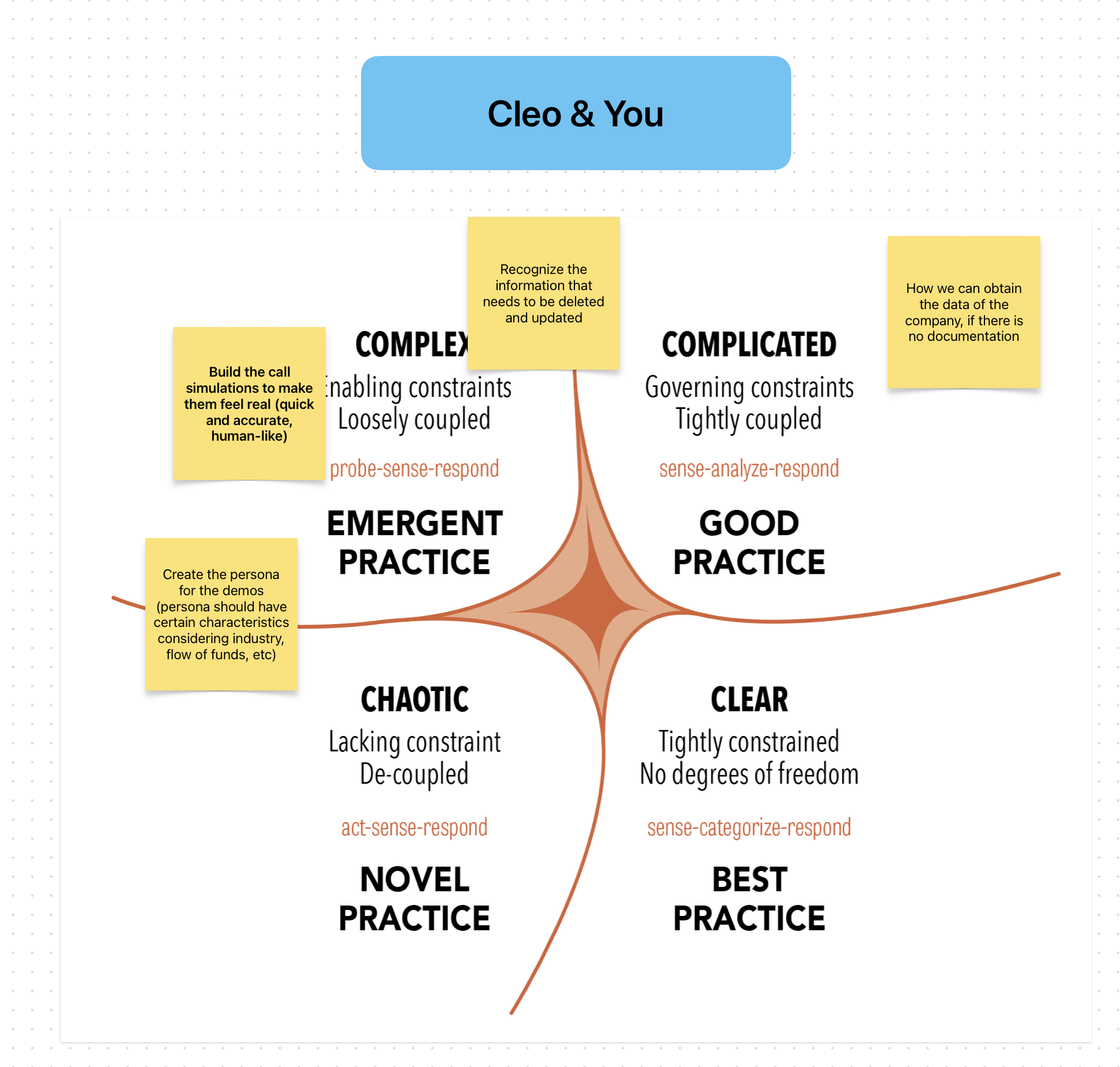
1. Mapping Complexity: The Cynefin Framework
Before we touched a single pixel, we needed to understand what kind of problem we were actually solving. Not all parts of Cleo are equally hard — and the design approach should match the complexity of each challenge.
We used the Cynefin Framework to categorize the key challenges across four domains:
| Domain | Challenge | Design Implication |
|---|---|---|
| Complex (probe-sense-respond) | Building call simulations that feel real — quick, accurate, human-like | Requires iterative experimentation. We can’t spec this perfectly upfront; we need to build, test, and adjust. |
| Complicated (sense-analyze-respond) | Recognizing which content needs to be updated or deleted | Solvable with expertise. Clear rules + good UX for content management. |
| Complicated | Obtaining company data when no documentation exists | Needs analysis — email ingestion, meeting recordings, alternative capture methods. |
| Chaotic (act-sense-respond) | Creating AI personas that match real customer characteristics across industries | Novel territory. No best practice exists — we need to act fast, learn from what works, and iterate. |
The Cynefin mapping gave us permission to treat different parts of the product differently. The simulation engine lives in the complex domain — we’ll probe and iterate. The content management system lives in the complicated domain — we can plan it methodically.
2. Finding the Core: What Is Cleo, Really?
Before designing screens, we forced ourselves to answer one question:
“If Cleo is one thing, what is it?”
The answer we landed on: a sparring partner, not a testing system.
The mental model isn’t “training software.” It’s a coach who hits you tough shots so you’re ready for the match. Like a tennis partner who doesn’t let you off easy — not a referee keeping score.
This reframe changed everything downstream:
flowchart LR
    A["Old Mental Model:<br/>Training Platform"] -->|reframe| B["New Mental Model:<br/>Coach Partner"]
    B --> C["Simulations are sparring,<br/>not tests"]
    B --> D["Scores show growth,<br/>not judgment"]
    B --> E["Sharing is showing off,<br/>not reporting"]
    B --> F["Privacy protects the<br/>learning journey"]
We defined five experience principles that would guide every design decision:
- Instant, always — Offline-first. No loading states, no “connecting…” The app is ready the moment you open it.
- Feels real, not like training — The simulation is the product. Minimal chrome. Closer to a phone call than a learning app.
- Opinionated and delightful — Every interaction is intentionally designed. Micro-animations, haptics, Dynamic Island. Craft is the brand.
- Progress, not pressure — Scoring motivates growth. Privacy protects the journey. Sharing is a celebration, not a requirement.
- Platform-native, not cross-platform — Leverage everything iOS and Android offer. This is why it’s native.
3. The Design Process: Generating and Evaluating with AI
This is where the week got interesting. Rather than starting from a blank Figma canvas, we used a structured AI-assisted design process that let us explore more directions, faster, than a two-person team normally could.
Step 1: Inspiration Analysis
We started by studying four products that nail the feeling we’re after — not because they’re in our category, but because they’ve solved similar UX problems:
mindmap
  root((Design<br/>Inspiration))
    Tesla Mobile App
      Status at a glance
      Haptic controls
      Offline-resilient
      No loading spinners
    Apple Music
      Full-screen immersion
      Browse-to-play transition
      Dynamic Island integration
      Offline-first downloads
    Linear
      Blazing fast
      Zero loading states
      Beautiful information density
      Keyboard-first on web
    NotebookLM
      Upload-and-transform concept
      Cautionary: too slow
      Cautionary: too generic
      Lesson: speed is non-negotiable
What we took from each:
- Tesla: Open the app, instantly know everything. No digging required. We applied this to the learner home screen — readiness status, recent sessions, and next recommended practice all visible without navigating.
- Apple Music: The transition from browsing to being in a simulation should feel like tapping play — instant immersion. Full-screen, distraction-free.
- Linear: The manager-facing web dashboard should channel Linear’s speed and intentionality. Dense information presented beautifully.
- NotebookLM: Same “upload and transform” promise, but executed with speed and specificity. Where NotebookLM feels sluggish, Cleo must feel instant.
Step 2: Anti-Pattern Identification
Equally important was defining what we would not do. We built an explicit anti-pattern list:
- No enterprise dashboard bloat (no 47-tab navigation)
- No onboarding wizards or tutorials (Tesla doesn’t explain itself; neither should Cleo)
- No completion-theater UX (no badge collections, no confetti for finishing mandatory modules)
- No generic AI interactions (no “I’m an AI assistant, how can I help you?” — the AI persona has a name, a mood, a personality)
- No NotebookLM-style processing delays (content transformation must feel instant)
Step 3: Six Visual Directions
With principles and inspiration locked in, we generated six distinct visual directions using our AI-assisted design workflow. Each direction explored a different approach to the same core experience:
| # | Direction | Philosophy |
|---|---|---|
| 1 | Minimal Zen | Ultra-clean, spacious, Tesla-inspired. Readiness score as focal point. |
| 2 | Bold Cards | Large hero cards, strong CTAs, fintech-inspired energy. |
| 3 | Dark Immersive | Fully dark, gaming/audio UI, performance dashboard feel. |
| 4 | Playful Coach | Warm, motivational, fitness-app-inspired streaks and progress. |
| 5 | Manager Dashboard | Linear-inspired density for team readiness views. |
| 6 | Context-First | Event-aware suggestions, prominent privacy badge, weekly rhythm. |
We built an interactive HTML showcase to compare them side-by-side. Here are three of the directions:
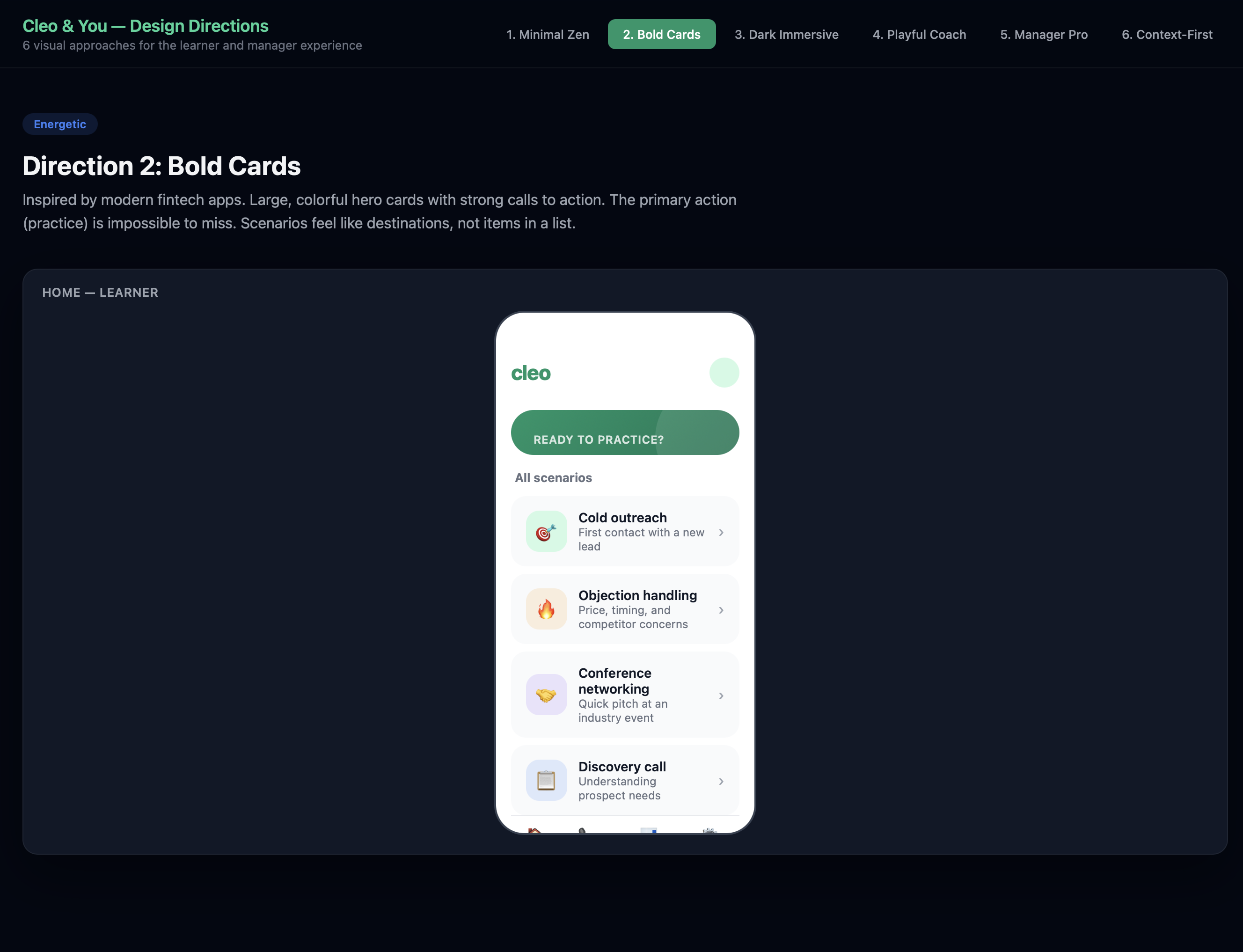
Direction 2: Bold Cards — The Winner
Large, colorful hero card that surfaces the most relevant practice scenario. Emerald green gradient hero with white CTA button — impossible to miss. The primary action (start a practice call) dominates the screen. Action-first design.
Direction 4: Playful Coach
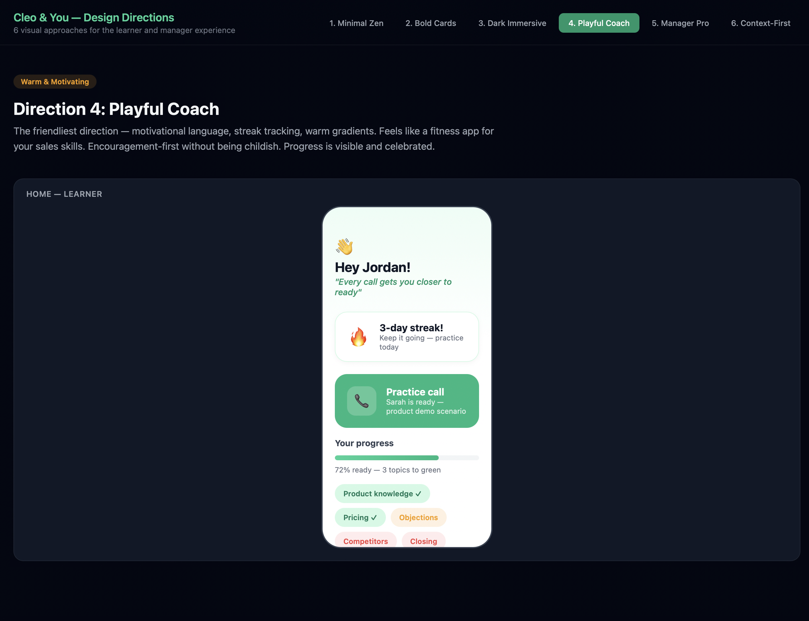
The friendliest direction — motivational language, streak tracking, warm gradients. Feels like a fitness app for your sales skills. “Hey Jordan!” with a 3-day streak and progress chips. Encouragement-first without being childish.
Direction 6: Context-First
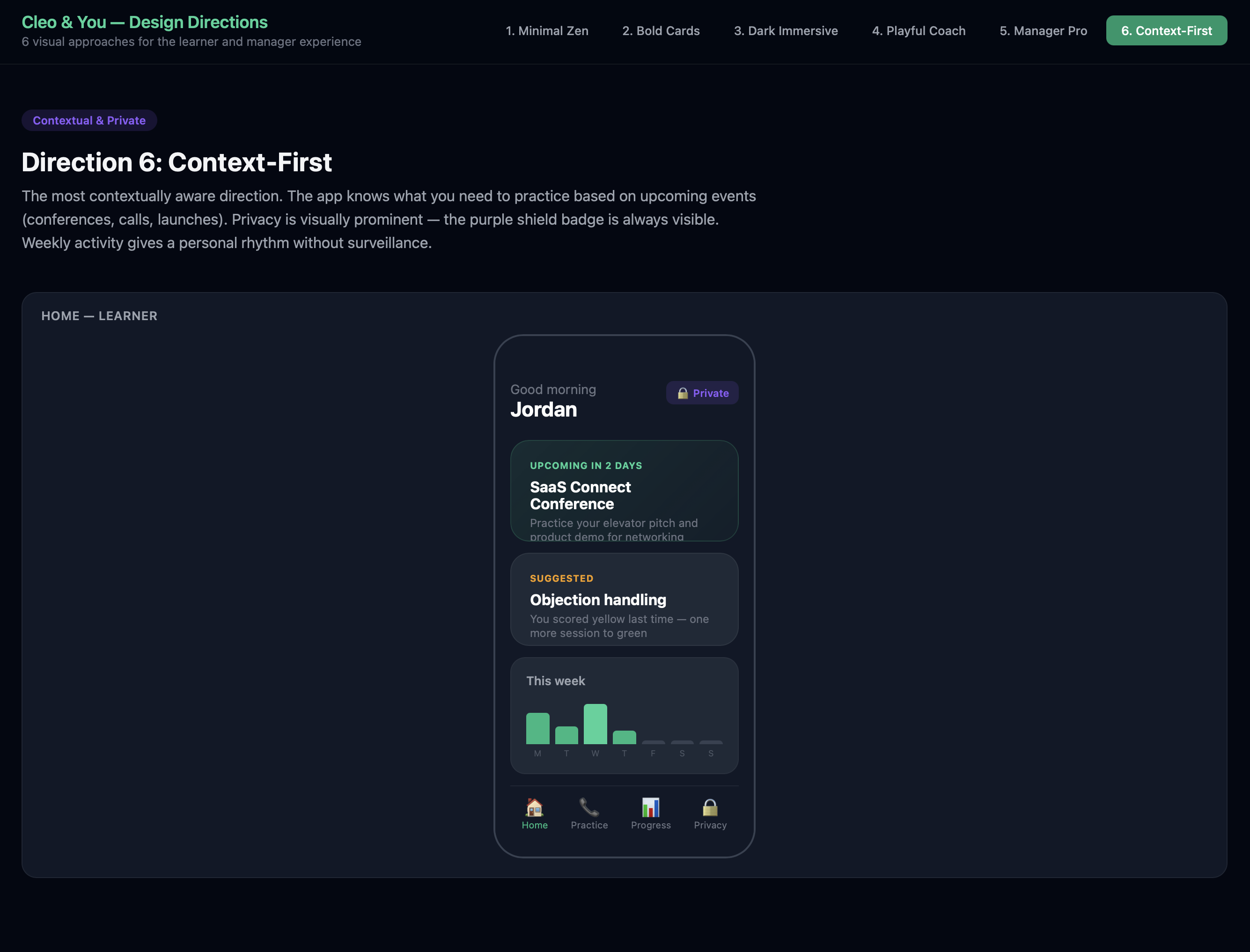
The most contextually aware direction. The app knows what you need to practice based on upcoming events (conferences, calls, launches). Privacy is visually prominent — the purple shield badge is always visible. Weekly activity gives a personal rhythm without surveillance.
Step 4: The Merge Decision
We didn’t pick one direction and discard the rest. We merged the best elements:
flowchart TD
    D2["Direction 2: Bold Cards<br/><em>Primary learner experience</em>"] --> FINAL["Final Design Direction"]
    D1["Direction 1: Minimal Zen<br/><em>Simulation + score screens</em>"] --> FINAL
    D5["Direction 5: Manager Dashboard<br/><em>Linear-inspired web layout</em>"] --> FINAL
    D6["Direction 6: Context-First<br/><em>Privacy badge concept</em>"] --> FINAL

    FINAL --> L["Learner Mobile:<br/>Bold Cards + Immersive Simulation"]
    FINAL --> M["Manager Web:<br/>Linear-Inspired Dashboard"]
    FINAL --> P["Privacy:<br/>Purple Shield Badge Everywhere"]

    style D2 fill:#10B981,color:#fff
    style FINAL fill:#059669,color:#fff
The rationale:
- Bold Cards for the learner home because it’s action-first — one tap to practice, under 10 seconds to hearing a voice
- Minimal Zen’s dark immersive screens for the actual simulation — the call experience should feel like picking up the phone, not using an app
- Manager Dashboard’s density for the web experience — managers need information, not pretty cards
- Context-First’s privacy badge — the purple shield carries into every screen, making privacy visible at all times
4. The Core Loop: User Journey Design
With the visual direction locked, we mapped the critical user journeys. The most important one — the learner’s first practice session — had to be flawless:
flowchart TD
    A["Opens app"] --> B["Home screen:<br/>readiness + hero card"]
    B --> C{"Taps 'Start call'"}
    C --> D["Context card:<br/>persona name, role, situation"]
    D --> E["Taps 'Call'"]
    E --> F["Screen transitions<br/>to dark immersive mode"]
    F --> G["Phone rings...<br/>persona picks up"]
    G --> H["Live conversation<br/>with AI persona"]
    H --> I{"Call ends"}
    I --> J["Full-screen<br/>score reveal"]
    J --> K{"Score result"}
    K -->|Green| L["Celebration!<br/>Share prompt appears"]
    K -->|Yellow| M["Encouraging:<br/>'Almost there' + tips"]
    K -->|Red| N["Directional:<br/>'Work on X' + retry"]

    style C fill:#10B981,color:#fff
    style J fill:#10B981,color:#fff
    style L fill:#10B981,color:#fff
    style M fill:#F59E0B,color:#fff
    style N fill:#EF4444,color:#fff
Key design decisions in this flow:
- No onboarding tutorial — the app is self-evident
- Hero card on home screen means the first action is obvious
- Under 10 seconds from app open to hearing a voice
- Score reveal is the emotional payoff — animated, celebratory, forward-looking
- Share prompt only appears on green scores — never pressure on yellow/red
- Private by default — the purple shield is always visible
The Privacy-First Share Flow
This was one of the harder design problems: how do you make sharing feel like showing off instead of reporting?
flowchart TD
    A["Learner hits green"] --> B["Celebratory score<br/>reveal animation"]
    B --> C["Share prompt:<br/>'Share with your manager?'"]
    C --> D{Decision}
    D -->|Share| E["Preview: exactly what<br/>manager will see"]
    D -->|Not now| F["Score saved privately<br/>Purple shield visible"]
    E --> G{"Confirm?"}
    G -->|Yes| H["Achievement sent<br/>Satisfying animation"]
    G -->|Cancel| F
    F --> I["Can share later<br/>from progress screen"]

    style A fill:#10B981,color:#fff
    style H fill:#10B981,color:#fff
    style F fill:#8B5CF6,color:#fff
The key insight: transparency creates trust. The learner sees exactly what the manager will see before confirming. “Not now” is never judged. The purple shield badge reinforces safety at every step.
5. Design System: The Foundations
We built a complete design system specification covering all three platforms. Here are the key decisions:
Color System
| Role | Color | Hex | Usage |
|---|---|---|---|
| Primary | Emerald | #10B981 |
Brand, CTAs, green scores, celebration |
| Primary Dark | Deep Emerald | #059669 |
Buttons, active states |
| Score Yellow | Warm Amber | #F59E0B |
Encouraging, not warning |
| Score Red | Soft Red | #EF4444 |
Directional, not alarming |
| Privacy | Purple | #8B5CF6 |
Shield badge, privacy indicators |
| Simulation BG | Deep Dark | #030712 |
Immersive call screens |
Platform Strategy
We made the deliberate choice to go platform-native, not cross-platform:
| Platform | Technology | Design Approach |
|---|---|---|
| iOS (primary) | SwiftUI | Custom components, haptics, Dynamic Island, Apple Watch |
| Android | Jetpack Compose | Material 3 base, heavily customized to match Cleo identity |
| Web | Tailwind + shadcn/ui | Linear-inspired, manager-focused, keyboard shortcuts |
Component Priority
We identified 10 custom components and ordered them by criticality:
block-beta
    columns 3
    block:p0["P0 — Core Loop"]:3
        A["Simulation<br/>Call Screen"]
        B["Score<br/>Reveal"]
        C["Hero Scenario<br/>Card"]
    end
    block:p1["P1 — Complete Experience"]:3
        D["Scenario<br/>List Card"]
        E["Privacy<br/>Shield Badge"]
        F["Readiness<br/>Indicator"]
    end
    block:p2["P2 — Growth"]:3
        G["Share<br/>Achievement"]
        H["Content<br/>Upload Zone"]
        I["Team Readiness<br/>Card"]
    end

    style p0 fill:#10B981,color:#fff
    style p1 fill:#F59E0B,color:#fff
    style p2 fill:#3B82F6,color:#fff
The P0 components — Simulation Call Screen, Score Reveal, Hero Scenario Card, and Context Card — deliver the complete practice-to-score experience. Everything else builds on top of that loop.
6. Behind the Scenes: The Workspace
This is what the process actually looked like — Linear for tracking issues, the code editor with AI conversations shaping the UX spec in real time, and the project structure growing organically as artifacts were produced.
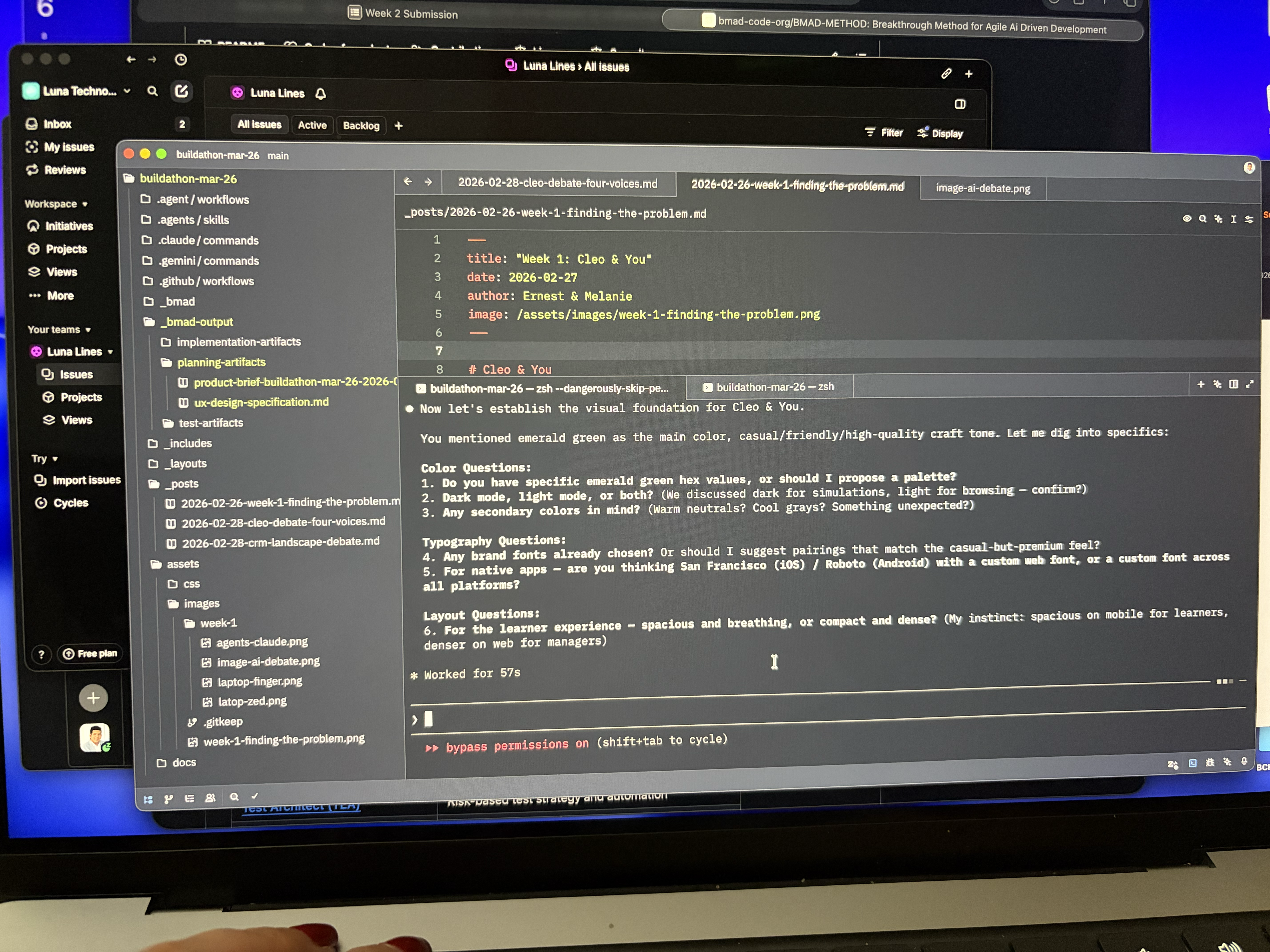
No Figma, no whiteboard — just structured prompts, iterative refinement, and a spec that wrote itself through conversation. The AI wasn’t generating mockups in isolation; it was asking us questions about color, typography, layout density, and platform strategy, then synthesizing our answers into a coherent specification.
7. What We Learned About AI-Assisted Design
This week was a real test of using AI as a design collaborator. Here’s what worked and what we’d do differently:
What worked well:
- Generating multiple directions fast — Six visual directions in a day. A two-person team couldn’t have explored that breadth manually.
- UX writing at scale — Error messages, empty states, accessibility labels. AI generated first drafts that we edited for tone.
- Structured specification — The final UX spec is comprehensive and implementation-ready. AI helped maintain consistency across 1,000+ lines of specification.
- Pattern analysis — AI was excellent at analyzing inspiring products and extracting transferable patterns.
What required human judgment:
- The merge decision — Which elements from which direction to combine required taste, not logic.
- Emotional calibration — How a red score should feel (directional, not alarming) can’t be specified by an AI — it has to be felt.
- Anti-patterns — Knowing what not to do (no badge walls, no completion theater) came from our experience with bad enterprise software, not from AI.
- Privacy as emotion — The insight that privacy isn’t a feature but an emotion came from human empathy with the learner’s vulnerability during practice.
8. Next Steps — Week 3
- Build the interactive prototype — Clickable flows for the core practice loop (home -> scenario -> call -> score -> share)
- User testing — Put the prototype in front of 5-8 target users and test: Does the flow feel natural? Is “under 10 seconds to a voice” achievable in practice?
- Technical architecture — Start mapping the design specification to implementation: API contracts, voice synthesis pipeline, scoring model
- Component development — Begin building the P0 components in SwiftUI
The Bottom Line
Week 1 was about should we build this? Week 2 was about what should it feel like?
We went from a validated problem space to a design specification that covers the complete learner and manager experience across three platforms. The key insight that drove everything: Cleo isn’t training software. It’s a sparring partner. That reframe — from compliance to confidence, from testing to coaching, from reporting to showing off — shaped every design decision we made.
The UX spec is done. Now we build it.